I'm by no means a designer, but with a bit of research into color contrast and accessibility, making I was able to build out a design that I was happy with.
In the previous post in this series I detailed my approach to research and design, for this building a personal blog series. This time, I'm going to provide some detail on how I approached choosing a color scheme for the site, which next to layout and font, is up there with the most important things to get right on a site.

Oh, I forgot to mention, this site is just an excuse for me to share photos of my cats, the above is Beau, he loves to meow for attention when comes back inside the house.
Picking a color theme
Choosing an initial color palette is something that I struggle with, thankfully, there are lots of sites out there for inspiration. One great one is colorinspo, a great way do use this site is to have a bit of a play with possible colors schemes to find ideas you like, if you are using a design tool like Adobe XD, you could experiment with colors by duplicating your designs to create variants.
The video linked above from DesignCourse is a great example of doing exactly that.
Using CSS Custom Properties
When it comes to implementing your theme in code I strongly recommend that you use CSS custom properties, they are supported everywhere that matters, and are great way to introduce a variety of colors schemes for your site.
If you want you can use SASS too, for example:
body  {
  --Primary: #${myColor}
}
Tip: also use custom properties as fills in your embedded svgs and have those automatically respond to your theme selection!
If you build a site from the ground up with theming in mind, then you can rapidly prototype new experimental color schemes, here's a theme I generated just by having a quick play in chrome. In the picture you can really see the power of using CSS custom properties in everywhere, including in SVG.
When I use custom properties for theming, I tend to start off with a small set of colors e.g. --Text, --Background, --Primary, --Secondary and expand as needed, for example you might want --Primary50 which could be a darker variant of your primary color.
As I mentioned, I'm no designer, I don't know any rules around making sure a variable maps perfectly to a shade on a color palette, but I suspect as your site grows you'll start to get a feel for how many colors you need.
Choosing an accessible color scheme
The most important aspect of your color choice should be ensuring that you have sufficient color contrast for your text against your background color.
This is not just to produce a nice looking design, but to also make sure that it is accessible to everyone.
You can go about this in many ways, if you like to design in the browser, or just like hacking around in dev tools, I found that using Chrome dev tools for checking color contrast was extremely effective. There are also plugins available in design applications, such as Adobe XD.
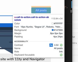
To use chrome to debug color contrast, I open up a random website, inspect an element that contains text e.g. a title, and then set its background and color properties. Dev tools will then provide you with color contrast information.
When modifying the color you should see a Contrast Ratio:
- 🚫 Means the contrast is not good enough.
- ✅ Single check mark means it passed AA conformance.
- ✅✅ Double check mark means it passes AAA conformance, gold standard level of accessibility.
- Ideally, you should try to target AAA and some suites e.g. government website have to meet this criteria.
- This article says it better I ever could.

Supporting dark and light themes can be a challenge
One of things I knew I wanted to do with my blog site was support a light and dark theme, using the CSS Custom properties technique above this is extremely simple to do, in a later article in this series I will show how to hook up the custom properties into a theme toggle.
Something, however, that I found quite challenging was find a primary branding accent color that worked in both light and dark theme, as well as being AAA accessible.
A technique which I found to work quite well is to choose your light theme primary color, and then adding white to the color (move towards white in color picker), to either find a sweet spot that works for both, or to generate an accent color specifically for darker themes. I also found that sticking to neutral (black/white) colors for my text went a long way to making sure I could get accessible text colors.
Tip: It is now possible to automatically check what users color scheme preference is using prefers color scheme, we will explore this later on the series.
When you find colors you are happy with be sure to check them for sufficient contrast against your text colors.
These the colors I went with for my first iteration:
A live demo
* {
  color: black;
  --Primary: #dd0d00;
  --Secondary: #e0dd6f;
}
div {
  background: white;
  display: flex;
  flex-direction: column;
  justify-content: center;
  align-items: center;
  padding: 1rem;
  height: 100%;
  width: 100%;
}
svg {
  width: 50px;
  height: 50px;
}<div>
<p>
This content will change
<strong style="color:var(--Primary)">color</strong>
<span style="color:var(--Secondary);"
>when you change the --Primary or --Secondary</span
>
</p>
<svg xmlns="http://www.w3.org/2000/svg" viewBox="0 0 32 32">
<g transform="translate(-339 -150.484)">
<path
fill="var(--Secondary, #fff)"
d="M-1978.639,24.261h0a1.555,1.555,0,0,1-1.555-1.551V9.291a1.555,1.555,0,0,1,1.555-1.551,1.527,1.527,0,0,1,.748.2l11.355,6.9a1.538,1.538,0,0,1,.793,1.362,1.526,1.526,0,0,1-.793,1.348l-11.355,6.516A1.52,1.52,0,0,1-1978.639,24.261Z"
transform="translate(2329 150.484)"
/>
<path
fill="var(--Primary, #000)"
d="M16.563.563a16,16,0,1,0,16,16A16,16,0,0,0,16.563.563Zm7.465,17.548L12.672,24.627a1.551,1.551,0,0,1-2.3-1.355V9.853a1.552,1.552,0,0,1,2.3-1.355l11.355,6.9A1.553,1.553,0,0,1,24.027,18.111Z"
transform="translate(338.438 149.922)"
/>
</g>
</svg>
<div></div>
</div>Now i'd explored how I chose colors for my personal blog, my next steps involved investigating illustrations, to make my design pop! Undraw is an awesome tool for this, however, I strongly recommend making your own illustrations, or heavily customizing illustrations that you find, them make them your own.