When I've started side projects in the past, I felt like I dug into code too quickly, without thinking about what I actually was building first, I wanted to try something a bit different this time.
Building something for myself
I've been working with web technologies for the best part of a decade now, from my first terrible attempts at building websites in tools like Adobe Dreamweaver, to building complex apps in my day jobs, using frontend and backend technologies (a lot of JavaScript).
However, something I've never had is a place of my own on the internet to just put stuff, so that's what I wanted to build, also it's probably another place I can just post pictures of my cats.
This article details some of the first steps that I took along the journey to building griffa.dev.
It's at this point of writing this blog post I got very distracted, trying to find an appropriate picture. Maybe I should have titled this post: How to not get distracted whilst working on a new project, it even occurred to me to write a component to auto generate a picture of my cats, probably would've been worth it.

Building a personal blog
Not very original, I know, but as part of this project I wanted to try and strip things back to basics, escape from the Webpacky Reacty Hook Hell of modern web development, and just build a nice static site.
Getting inspired
I watch a lot of YouTube, mostly Gaming related content, but over the years I've watched several programming related channels, one of the best, and most well known, is Traversy Media.
The specific video that got me really inspired to build something myself was a guest video by Design Course, another great channel. This video spoke to me because I'm quite happy coding but I've always wanted to brush up on my design skills.
The above video, sent me on a bit of a binge of Design Course content, it all helped me a lot with focusing on good design, instead of getting bogged down by code.
Some of the principles the videos taught me:
- Color: choosing a good color scheme is important, but even more important than that colors should be accessible i.e. sufficiently contrasting. This can be very tricky when implementing both light and dark themes!
- Importance of whitespace: having appropriate spacing around elements.
- Visual hierarchy: ensuring things are appropriately sized based on importance.
- Typography: choosing a good font, unless you know what you are doing, going for a nice san-serif font will be the best bet for the web.
- Scale: ensuring items are appropriately sized on the screen, in relation to other elements.
- Alignment: this is a real important one, its important to ensure that padding and margins and spacing is consistent throughout a design.
This doesn't really do the videos justice, I can only recommend watching them:
- UI Design For Coders
- 9 UI Design Techniques That Will Last Forever!
- 9 Tips for Becoming a GREAT UI Designer
Planning things out
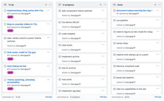
A quick one, but I found setting up a simple project on Github really helped me with tracking my progress and ideas, it also gave a nice feeling moving things over to done.
I made a label for posts, which meant it was easy for me to track ideas for things I wanted to write about.

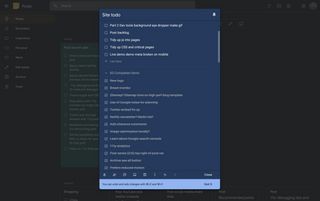
I also made heavy use of a Notes app throughout the project, which really helped with not just a todo list, but documenting any bugs I found whilst using the site.

There was a another recent guest video on Traversy Media which describes some of the techniques I have used for planning out this project, as well as some other great advice.
Technology choices
I don't want technology choice to be a focus of this post, I wanted to focus on things I did to plan and design my project.
However, it's a good idea to search around for prior art, or libraries/frameworks you might want to consider.
You should be using a static site generator for a personal blog, starting out with a frontend JavaScript framework, is more than likely just a bad idea.
Static site generators
- Gatsby JS: React-based. I write enough React at work,and quite frankly I'm sick of the complexity it forces upon you.
- Jekyll: Powers Github Pages, built in Ruby.
- 11ty (Eleventy): Inspired by Jekyll, NodeJS based, supports a lot of templating languages.
- Lots more out there (I went with Eleventy)
Other sites I investigated for inspiration
- web.dev - Web development blog/learning site by Google, built using Eleventy and Web Components, they posted about their architecture here.
- dev.to - Really awesome blogging site, not sure as to their architecture
- open-wc - Awesome Web Component Recommendations, built using Eleventy.
- There's also Medium, I guess.
Designing a layout
The subject of the article mentions:
I felt like I dug into code too quickly, without thinking about what I actually was building first, I wanted to try something a bit different this time.
By this, I mean I've tried diving straight into code and designing in the browser, for me, this hasn't worked, I'm sure it works for other people.
I think the main reason that this does not work for me is that I can get far too distracted too easily, especially when coding, focusing on things that don't really matter, instead I choose to use a design tool.
Designing in Adobe XD
I looked around for what design tools are out there, the big one most people seem to recommend is Sketch, or React hipsters suggesting Figma.
For my work, I chose Adobe XD, why - it has a free version!.
This was the very first time i'd used Adobe XD and I got on extremely well with it, I think if you have used any of the other Adobe products e.g. Photoshop or Illustrator, you will get to grips pretty fast, especially since some of the shortcuts are the same!
If you want to try it out I can only recommend (again) watching UI Design For Coders Adobe XD is used there, watching this video gave me most of the tools I needed to build out a design.
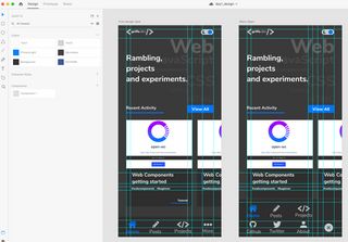
After first day of research and design I had a first pass at a mobile layout for a potential blog site.

In the next post I'll explore how I iterated on the above design, implementing dark and light themes, using CSS variables.